Re-defining Restaurant Tip Mangement Experience
Tip Tool
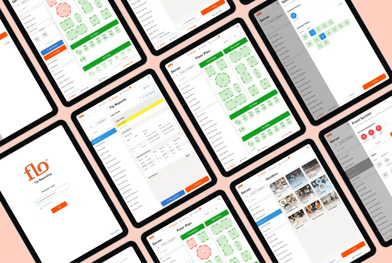
I was a solo designer at Tip Tool, a Restaurant Tip Management
Enterprise App. The client (OTG) wanted to add in new features and
improve UI of their outdated app.
I
collaborated with product manager and engineering team
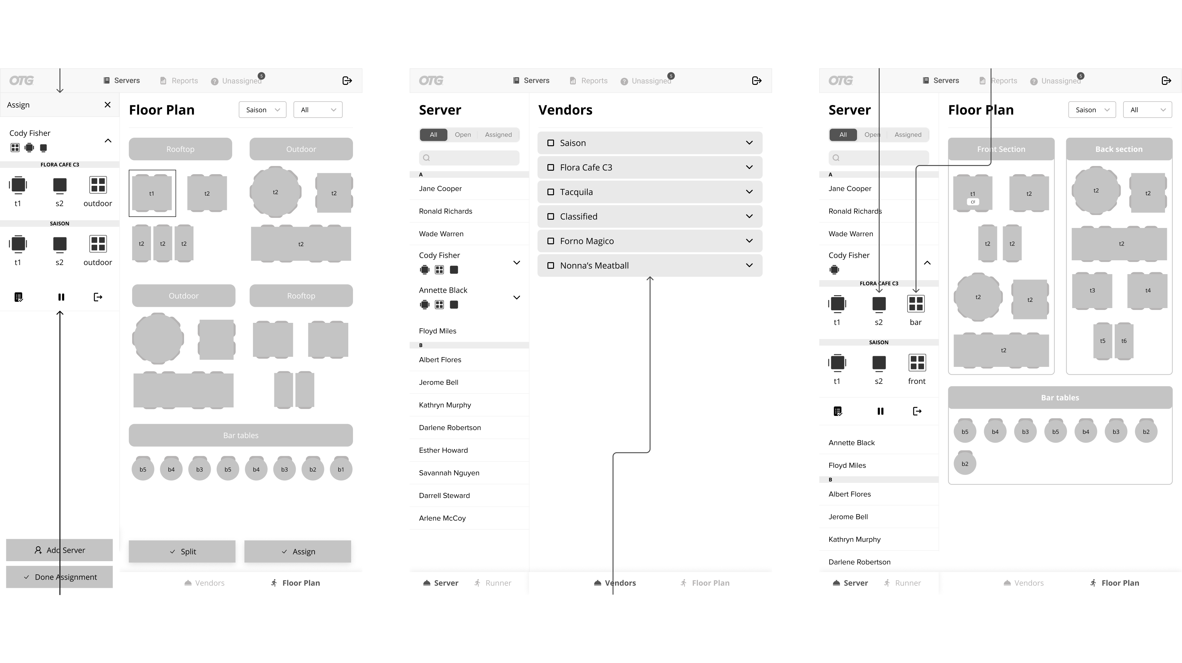
to create wireflows and visual designs. While designing wireflows,
I’ve
cut down 30% of interaction cost
while assigning multiple servers on a table.
-
Platforms
iOS
-
Deliverables
Wireflows, Visual Designs, Design System
-
Timeline
June 2021 - Nov 2021
Tip Tool
Tip Reporting
Tip tool is a tip management application designed to manage tips in airport restaurants owned by OTG. Tip tool digitizes the way how tips are assigned to servers working on one or more tables. Restaurant managers can assign servers to tables, start break for servers, release previously assigned tables, track the tips and assign them to respective crew members (ie. servers or runners) all within the platform.
Product Vision
Business Goals
OTG wanted to make the existing Tiptool app more robust by:
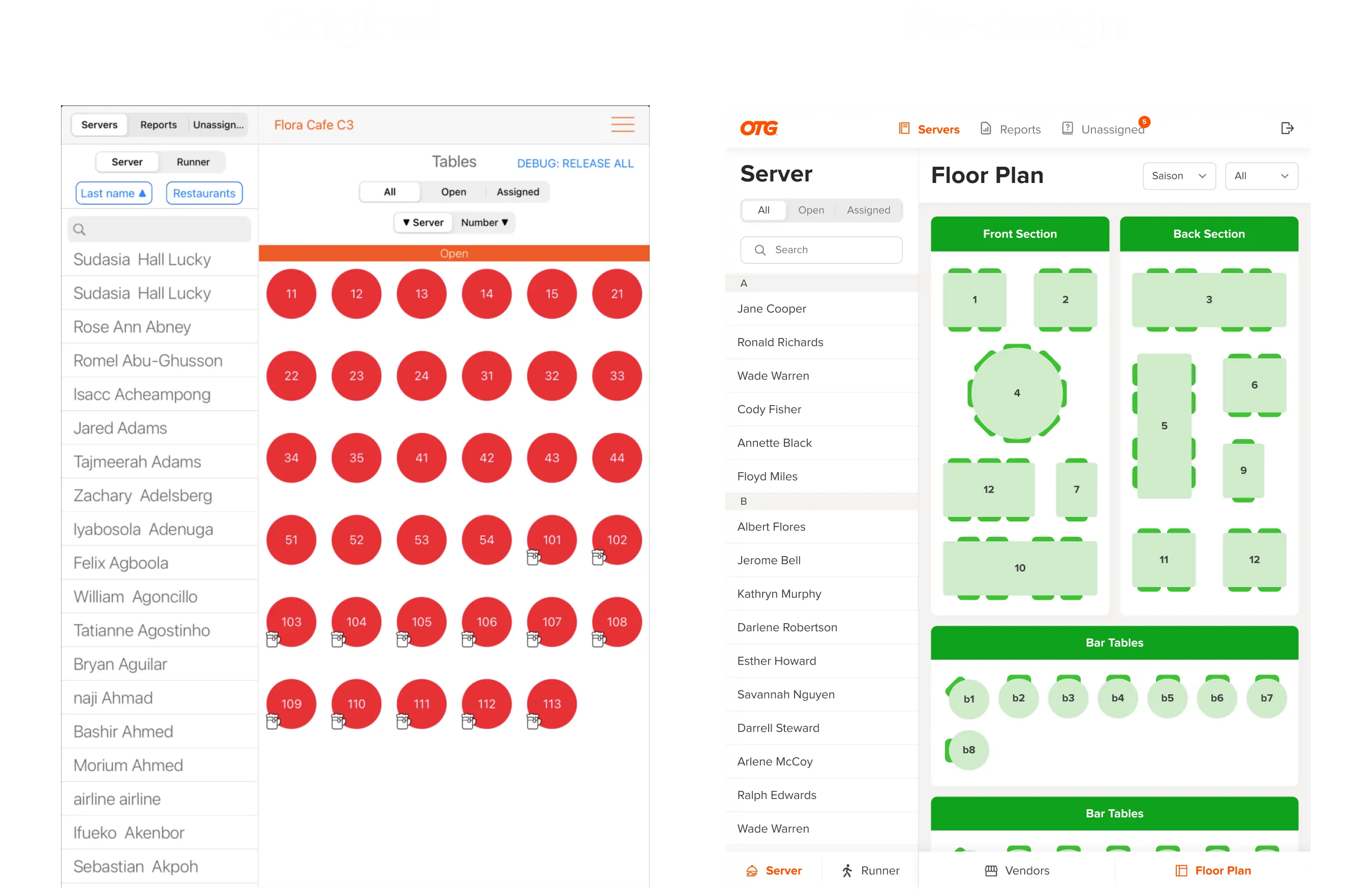
- Adding floor plans and sections for each vendor
- Managing tip reports from the app
- Adapting to real world table/seat assignments
- Simplifying user experience
Analyzing existing App
Heuristic Evaluation
Looking into the user manuals, playing through the existing app and
consulting the product owner, I understood the core functionalities
of Tiptool.
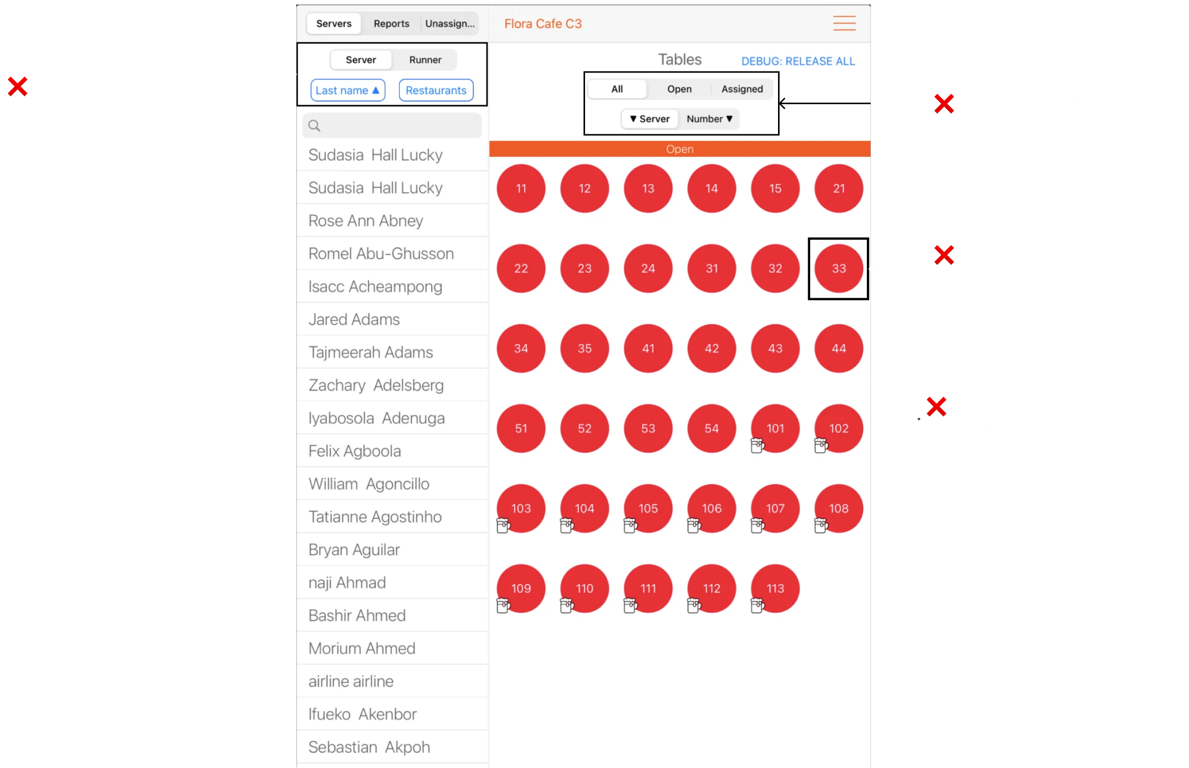
While going through some functionalities, I noted down some areas
that needed improvement.
Looking at the Industry
Competitor Analysis
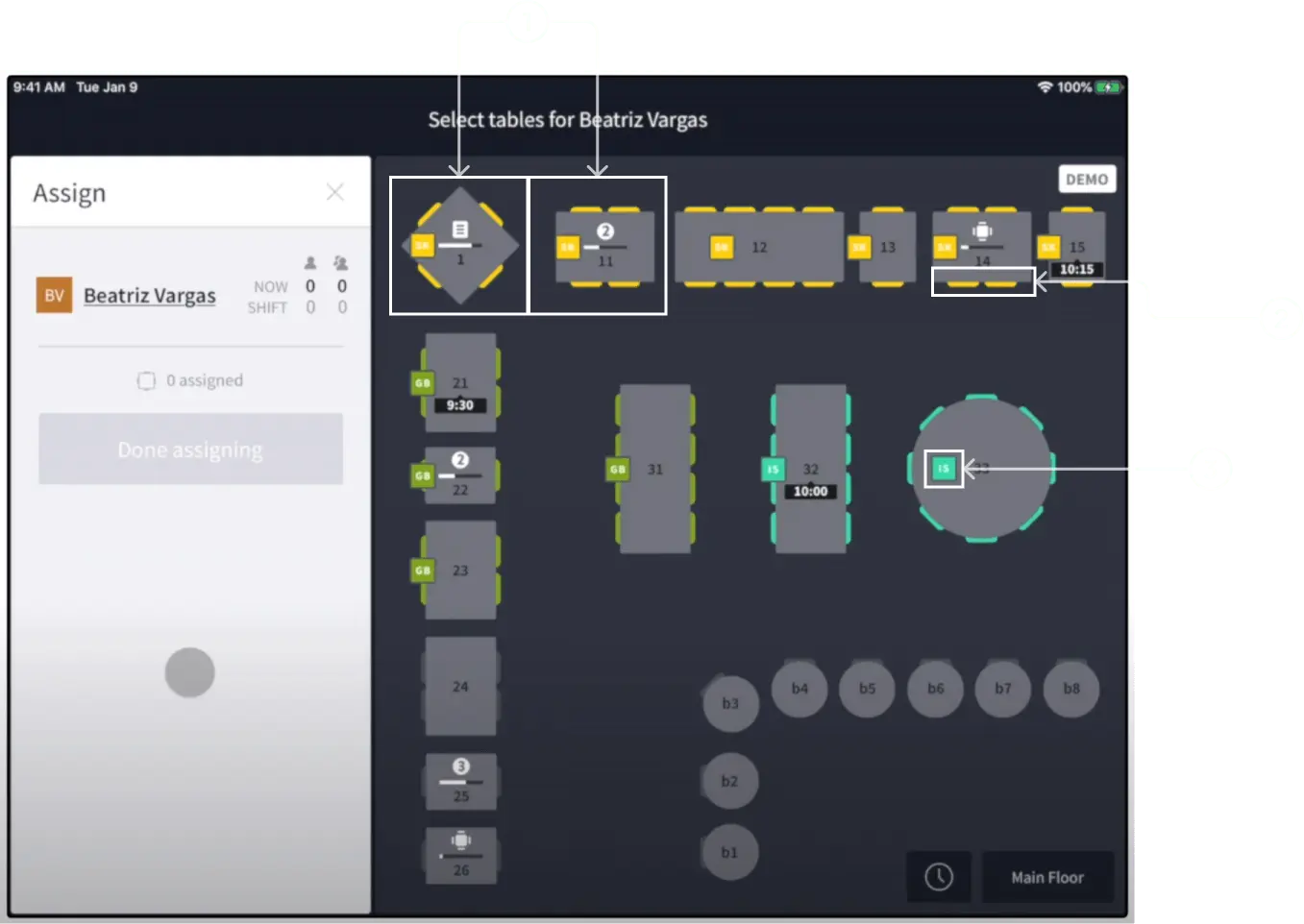
OpenTable for Restaurants (recommended by client) is a similar enterprise app but it deals with seat bookings and reservations on restaurants.
Inspirations
Diving into OpenTable for Restaurants, I liked how they:
- Used semi-realistic table layouts
- Denoted tables with color codes
- Represented customers seated on tables with name initials
Experimenting Ideas
Ideation
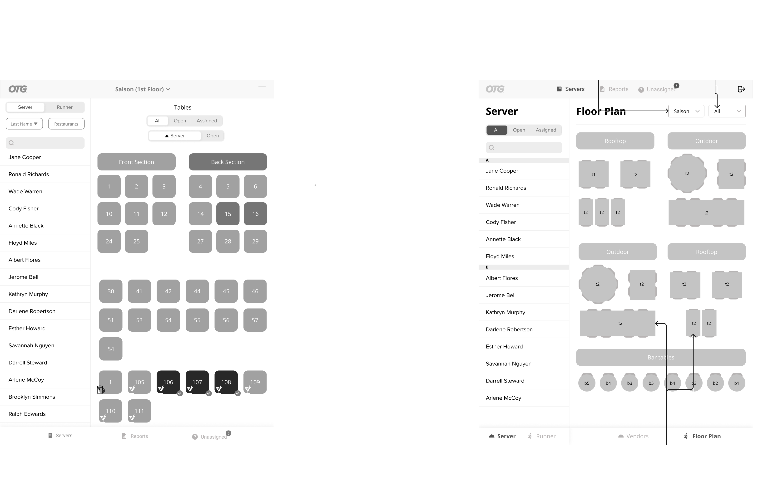
Getting the Flow Right
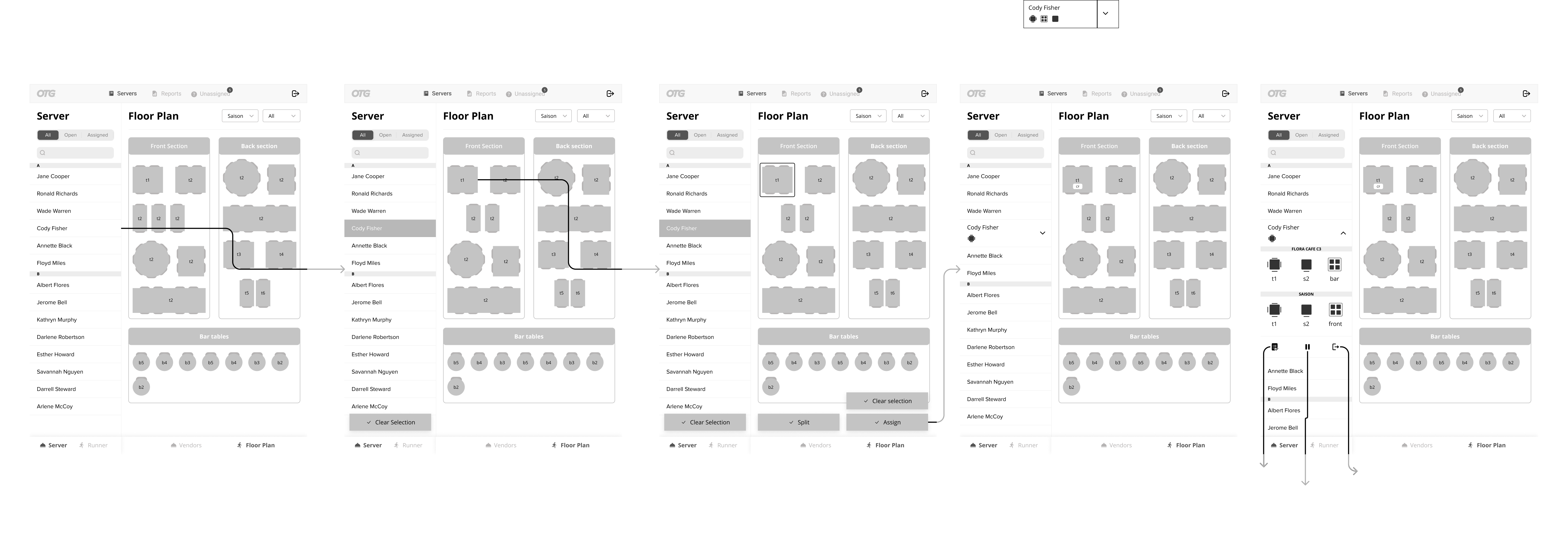
Wireflows
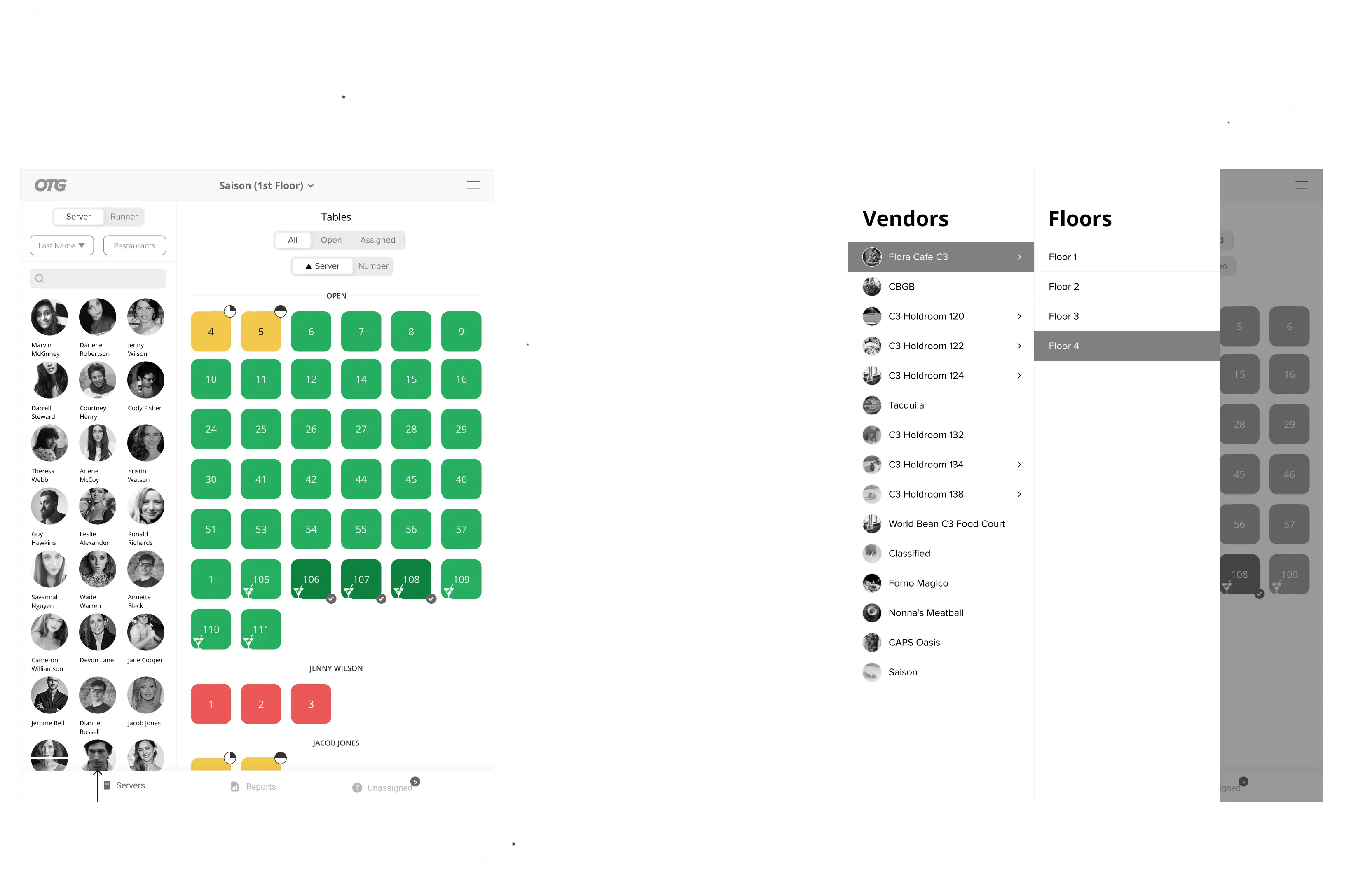
Reflecting upon some of the critical areas of improvement, similar
apps and possible solutions, I started creating wireflows and
validating it with the product owner.
After 3-4
iterations, we were pretty aligned with the product vision.


Adding Floor Plans and Sections
Visual Designs
Adapting to Real World Table/Seat Assignment
Visual Designs
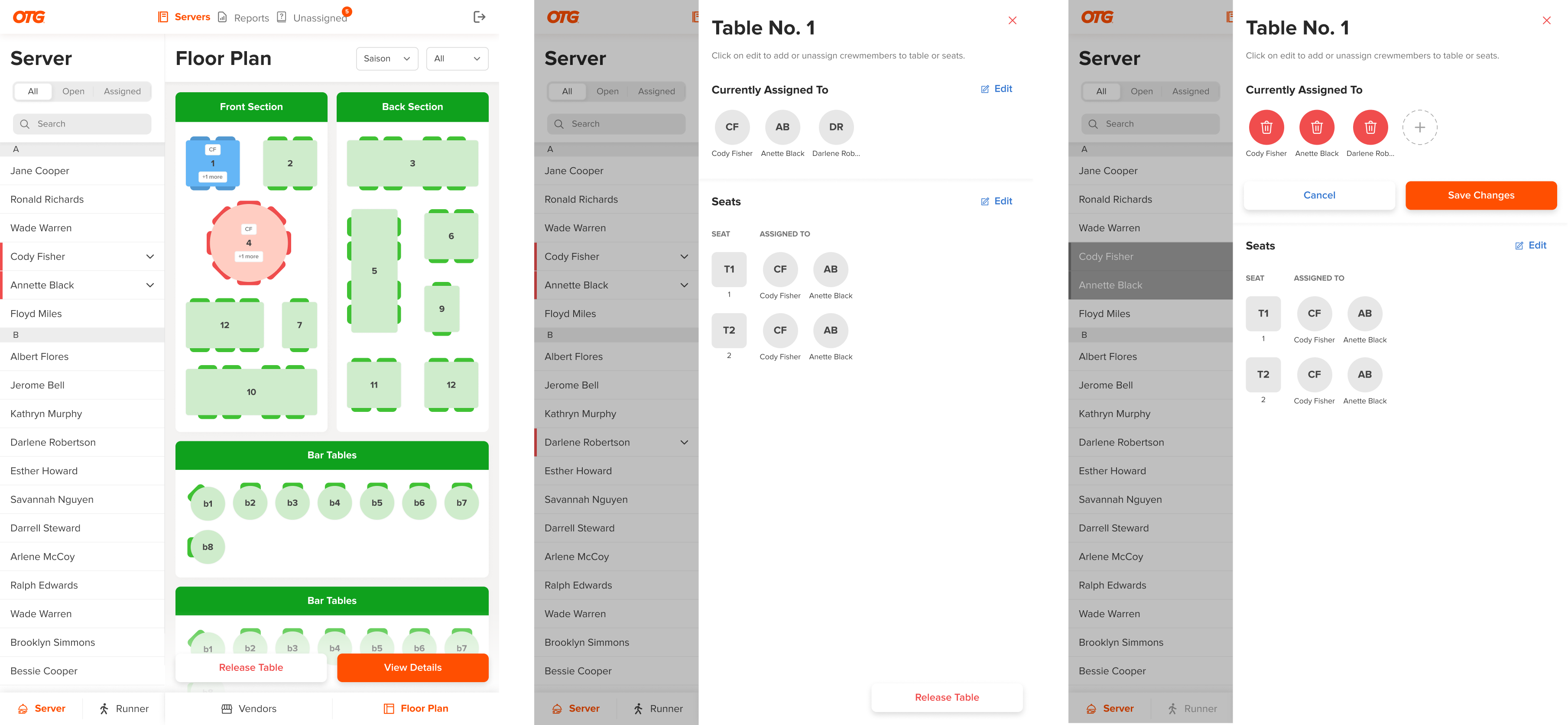
Getting inspired from Open Table for Restaurants, I've implemented semi-realistic table layouts, initials on tables once it is assigned to servers and colors to represent table states: available and occupied.
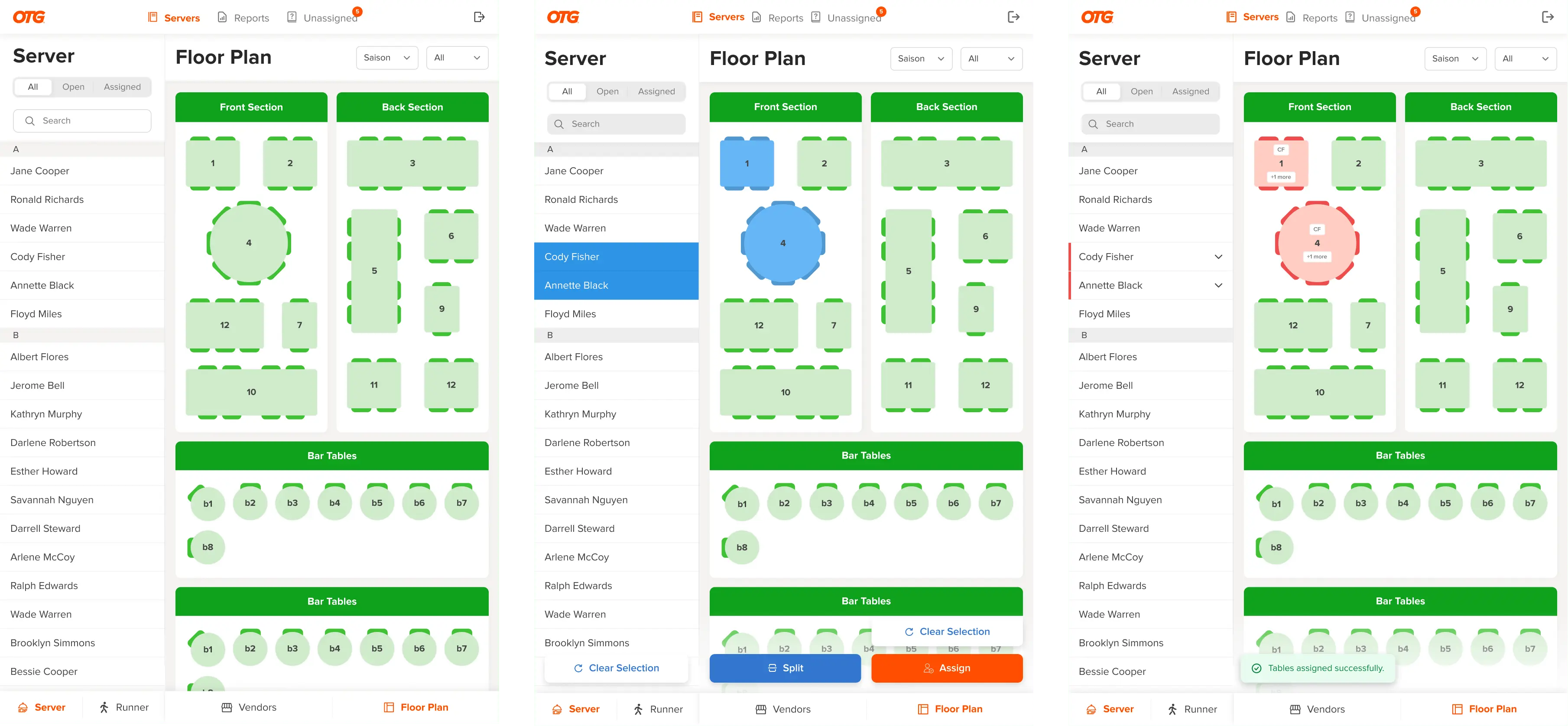
Viewing table assignment was not possible in the old app. In this flow, I've tried to address the problem of releasing specific tables so that the managers can quickly clear server assignments once customer leaves the table.
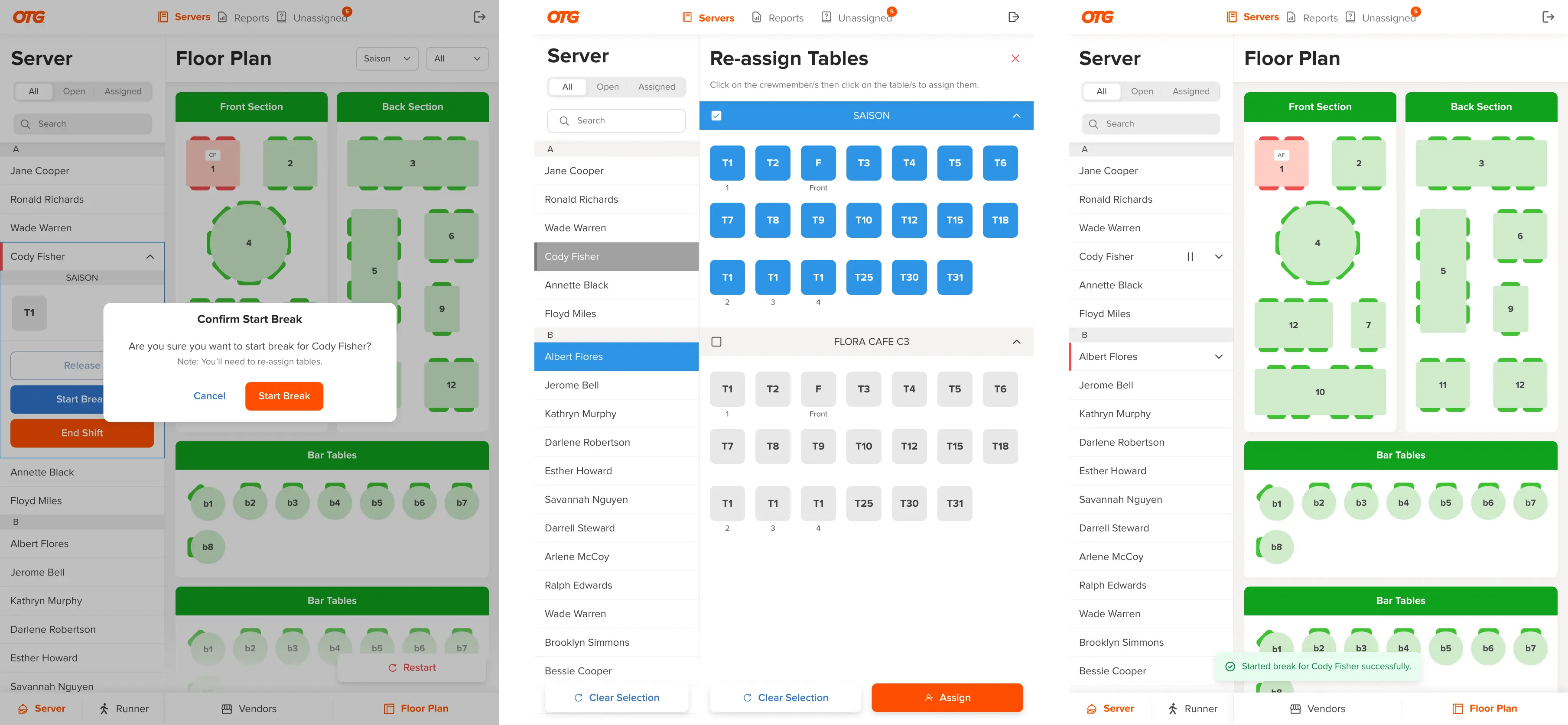
Starting Crewmember's Break
Visual Designs
Managing Tip Reports
Visual Designs
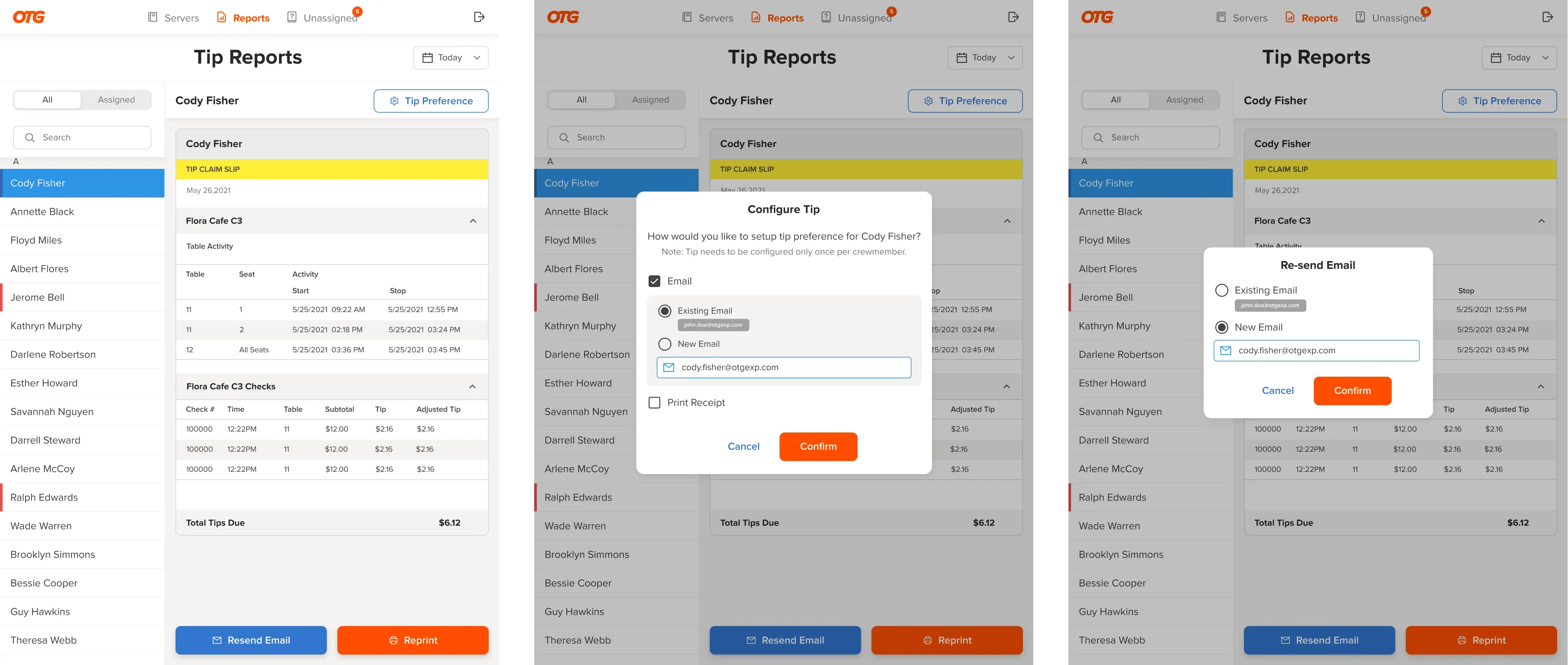
Tip reports are generated once server's shift ends. The tip details can be forwarded to servers email or printed right within the restaurant so that servers can claim their tip for the day.
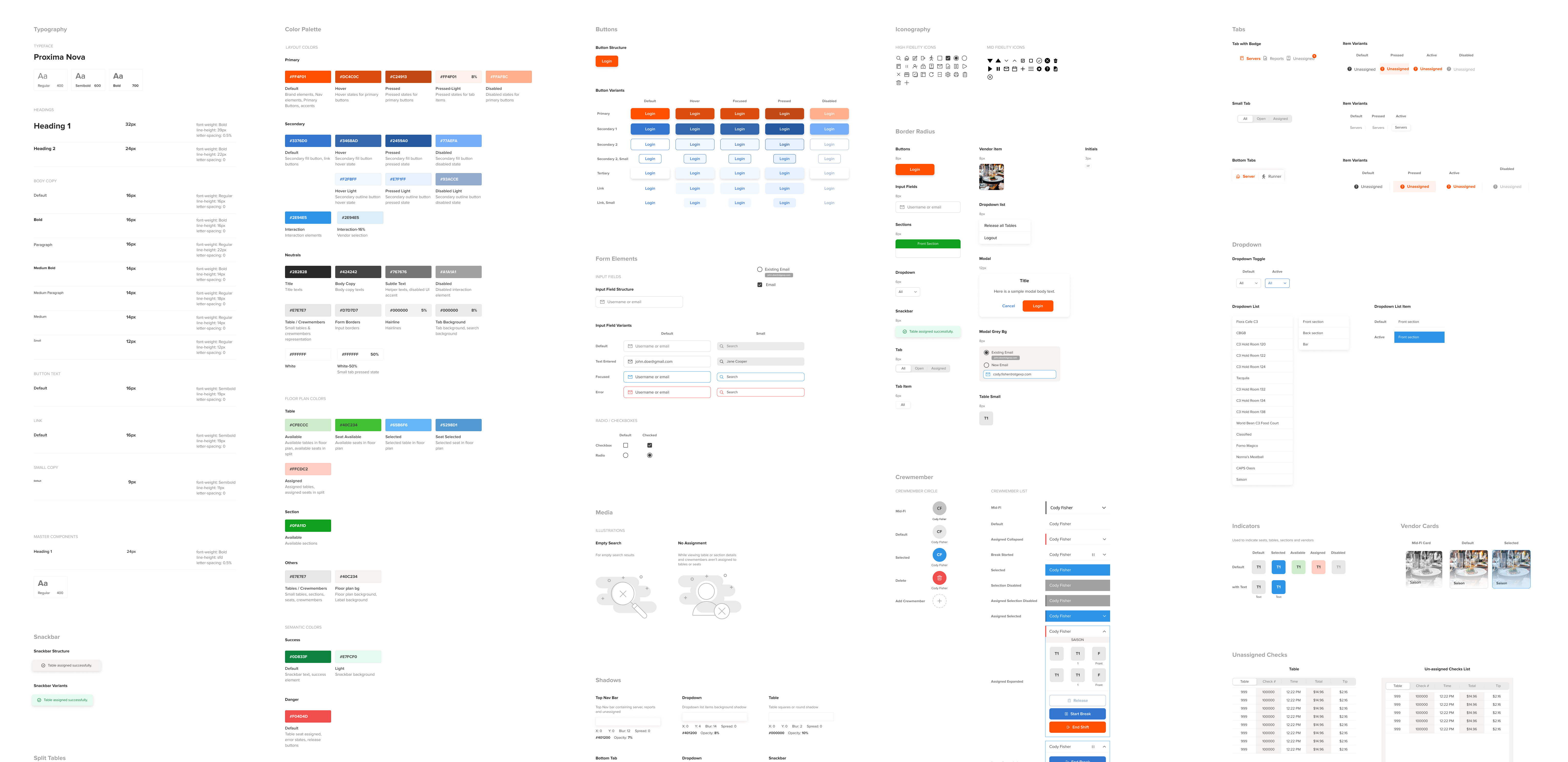
Creating Design System
Developer Handoffs
Design Decisions that didn't make upto Final Designs
Rejected Ideas
Key Takeaways
Learnings
Since this was my first time working on an enterprise-level
application, I got to learn a lot from this project some of which
include:
- Constraints in Enterprise space
- Prioritize functionality over aesthetics
- Consult with engineering teams as early as possible to understand feasibility