Reminding Nepali Muslims of their Prayer Times
Sultana
Design Rush
I was a product designer at Sultana, a prayer app targeted towards Nepali Muslim People. The client wanted to create an all in one app where users can read Quran, Hadith, track their prayer times and spread love across community.
I
led the project
from the starting phase by
conducting UX Research, establishing information hierarchy, creating designs
and
testing design choices
with target personas.
-
Platforms
Android
-
Deliverables
Personas, Journey Maps, Wireflows, Visual Designs, Design System
-
Timeline
Aug 2020 - Dec 2020
Sultana
Prayer Reminder
Sultana is a prayer app targeted towards Nepali muslim people which reminds users of their prayer times, shows prayer directionbased on their location and has a community where people can discuss different topics. Sultana aims to be all in one app for muslim people by including: Hadith and Duas which isn’t available in other similar apps.
Product Vision
Business Goals
The client wanted to contribute to Nepali Muslim Community by creating a mobile app with following set of features:
- Track prayer times based on location
- Show prayer direction based on location (Qibla)
- Quran, Hadith and Duas
- Community to help others in need
Understanding Muslim Culture
User Interviews
Following a different religion, it was hard for me to understand Muslim culture. So, I had one of my Muslim friends help me understand all the cultural keywords.
I collaborated with the client to recruit a few interview candidates from the Nepali Muslim community. Then, I conducted 1-1 interview with 5 participants remotely (due to COVID-19).
Interview Outcomes
The interview sessions helped me identify similar apps used by the users and uncover some issues faced by users while using those applications.
Looking at the Industry
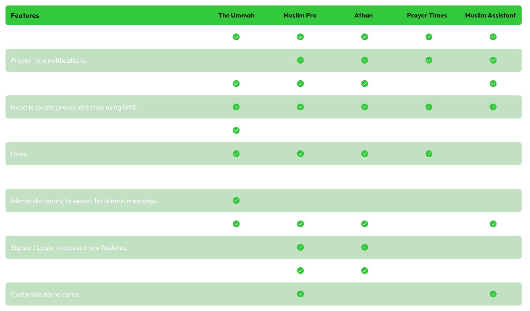
Competitor Analysis
Based on interview outcomes and my research, I reviewed similar apps to better understand their features and functionalities.
Reflecting upon Interviews
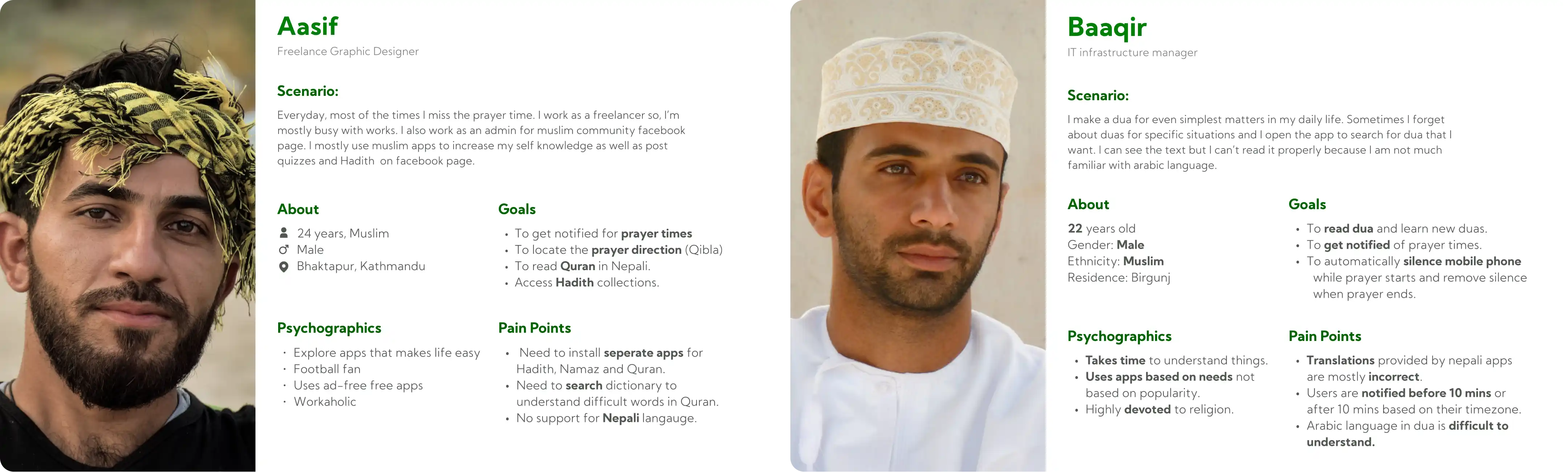
Personas
After reviewing similar applications, I had better idea about the issues that interview candidates mentioned. So, I mapped those issues into personas.
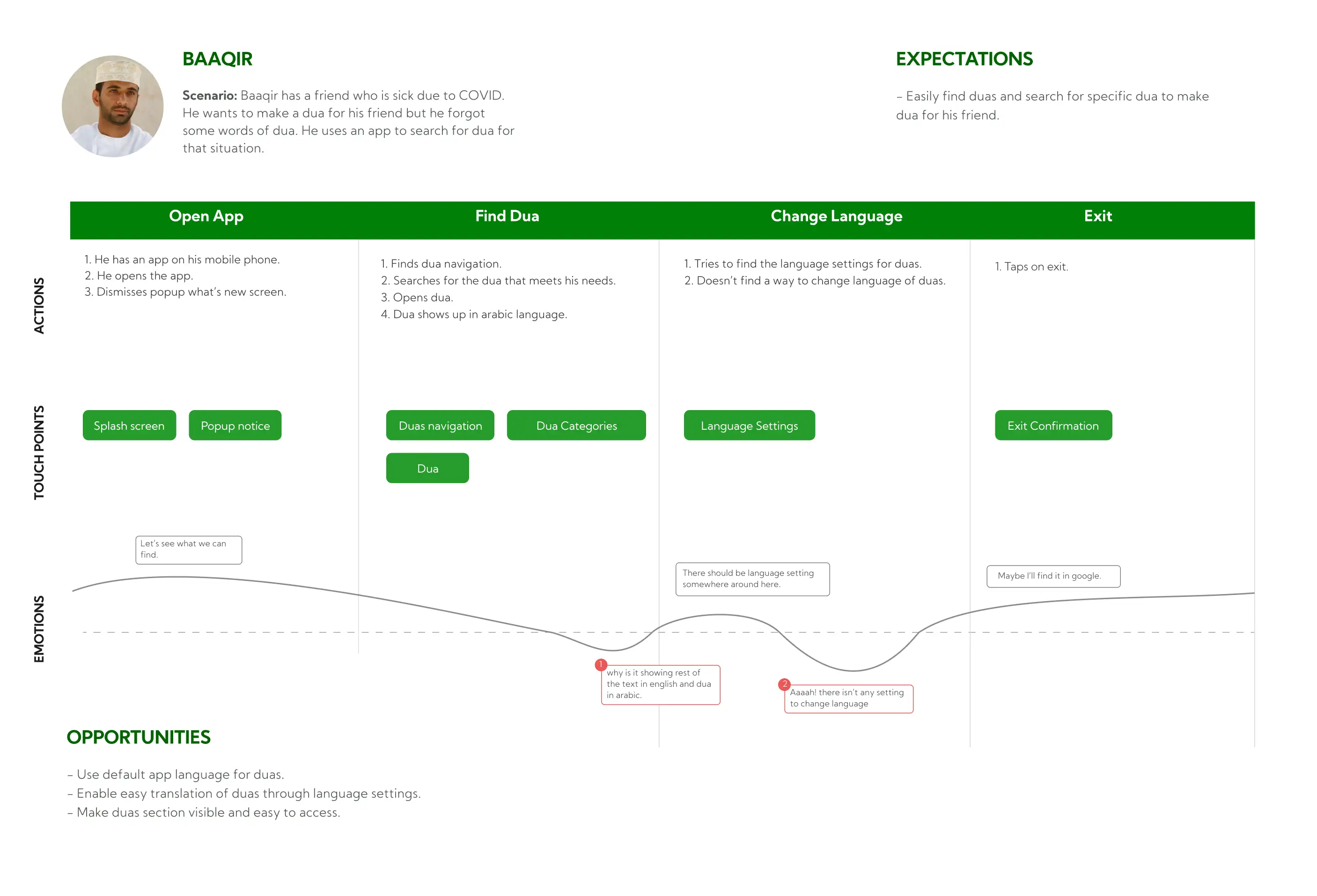
Journey Maps
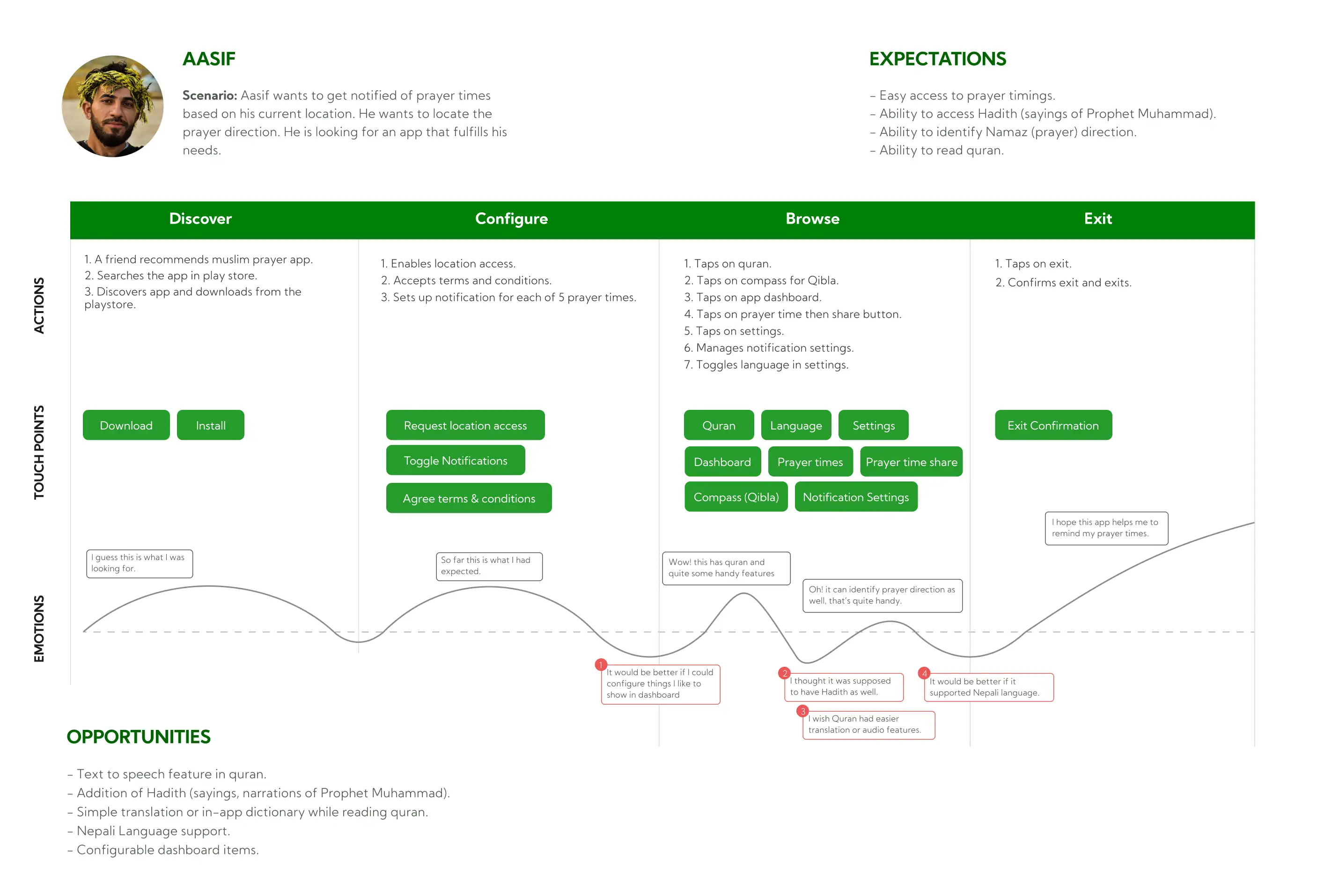
During the interview session, the candidates shared some of their experiences on how they’ve faced problems with similar apps.
I translated those experiences into journey maps to reveal possible opportunties.
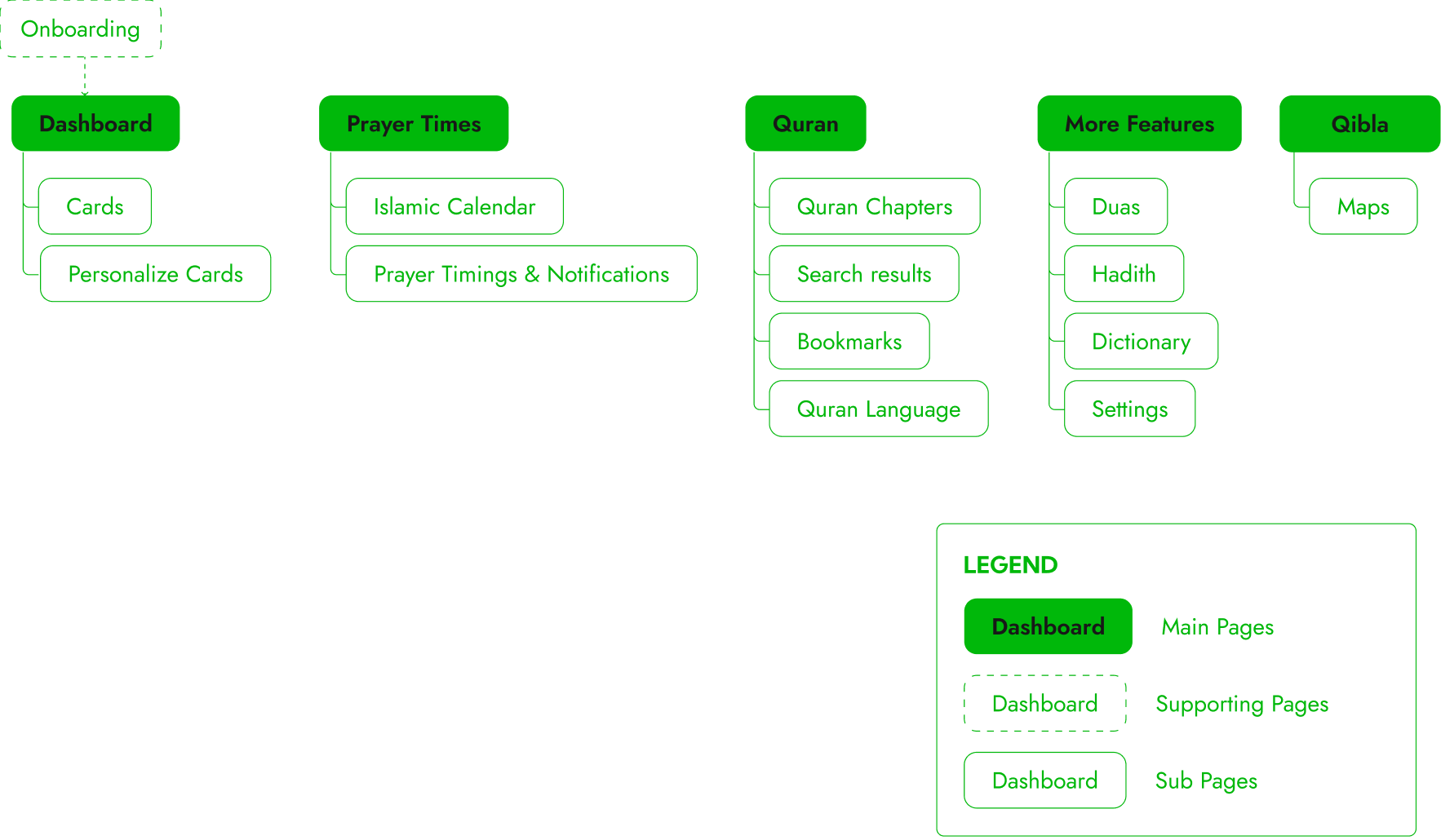
Setting up Information Hierarchy
Sitemaps
Sketching Ideas
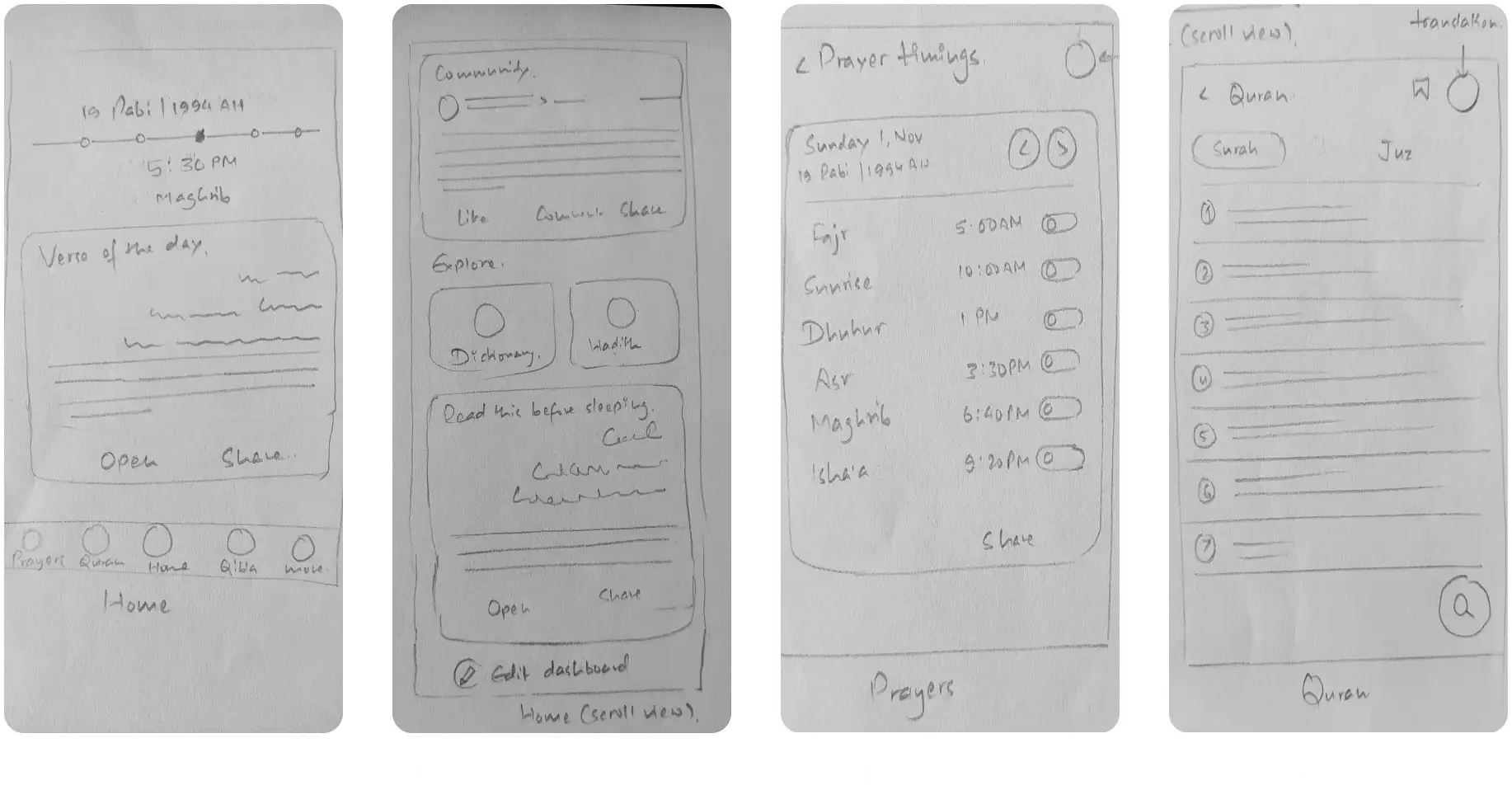
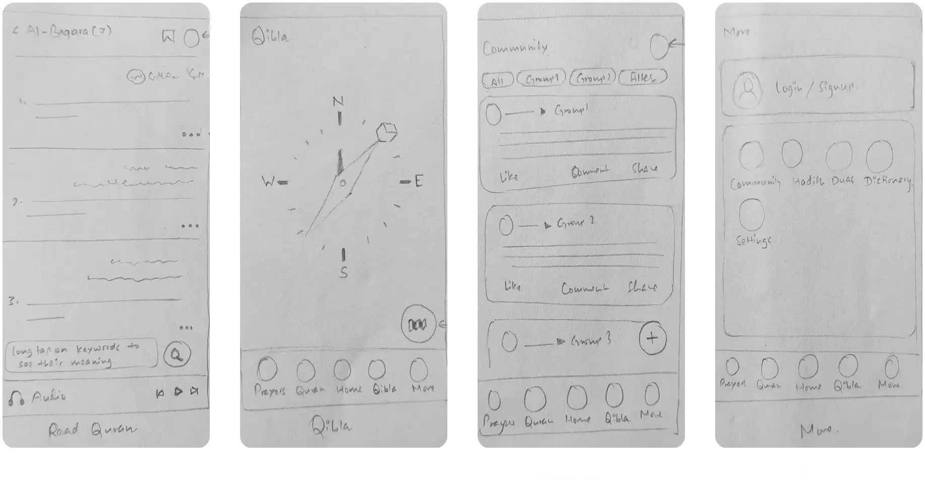
Lo-Fi Designs
Looking back at user personas, similar applications and information hierarchy, I started rough sketches to quickly move back and forth betweeen ideas.
Getting the Flow Right
Wireflows
I validated the sketches with the client and after 3 iterations, we were aligned with product vision.
Then, I started creating wireframes and connecting them based on the information structure.
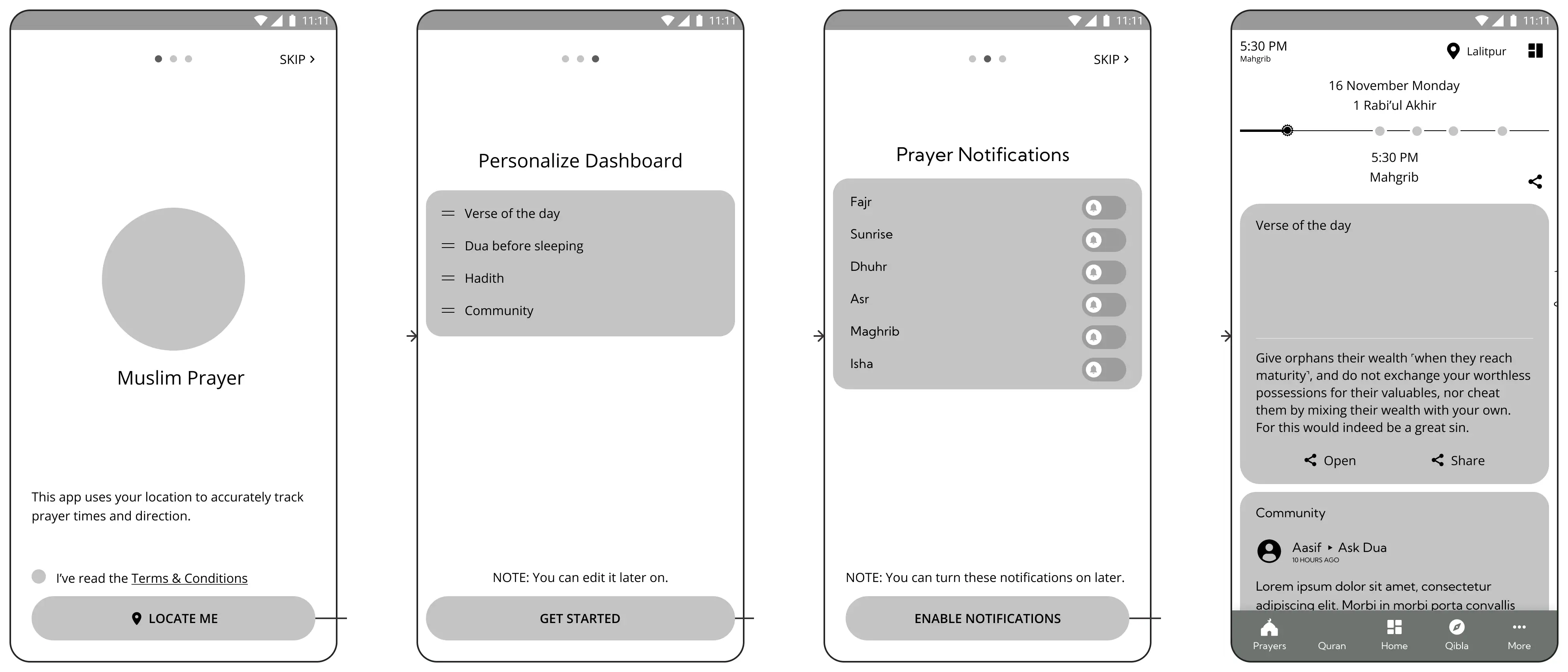
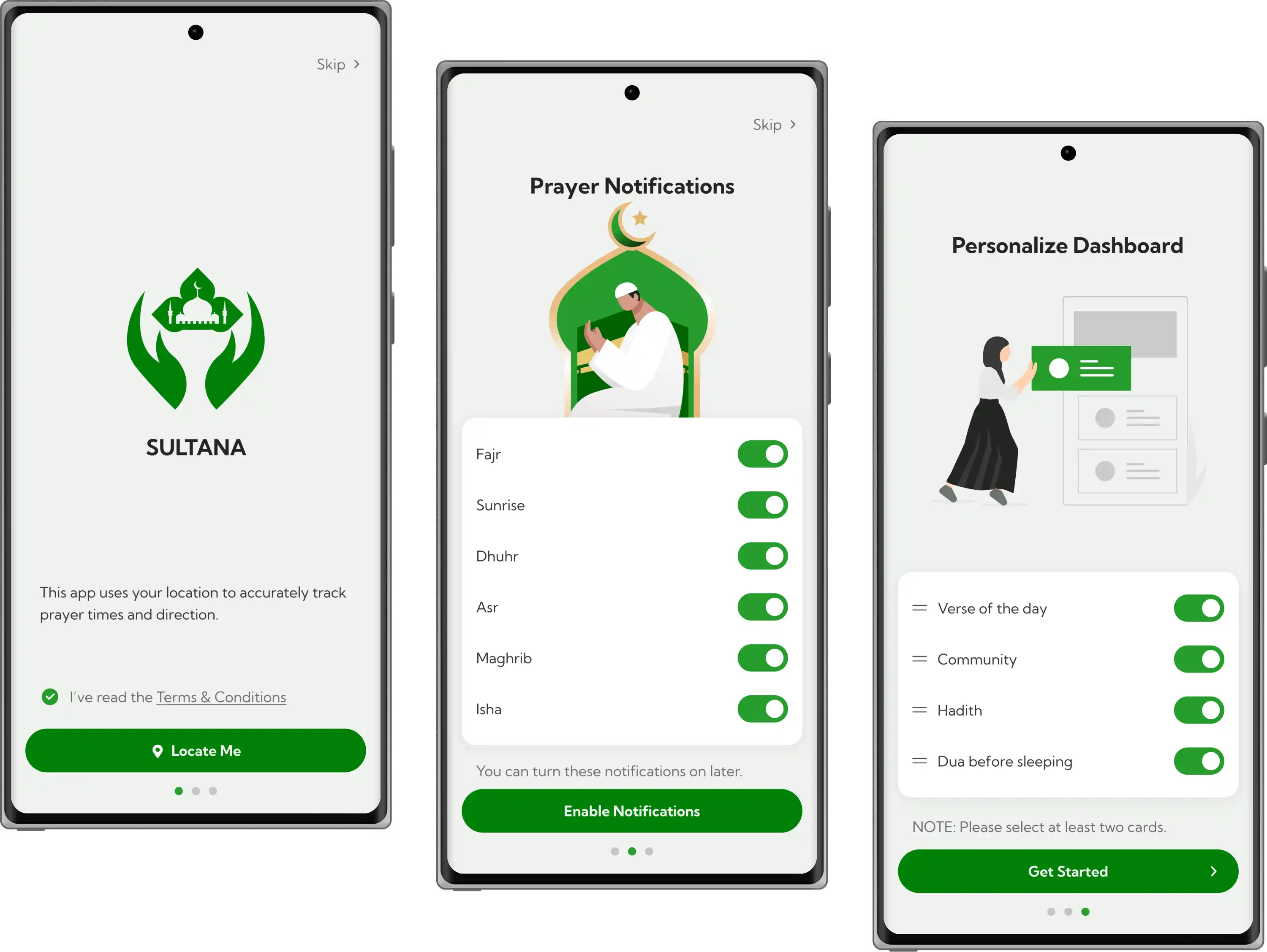
Refining Onboarding Experience
Visual Designs
Streamlining the Homepage
Visual Designs
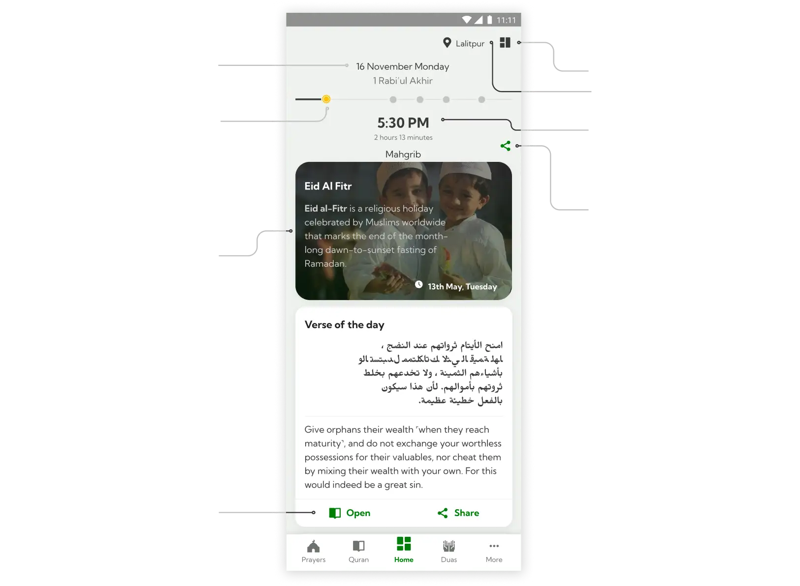
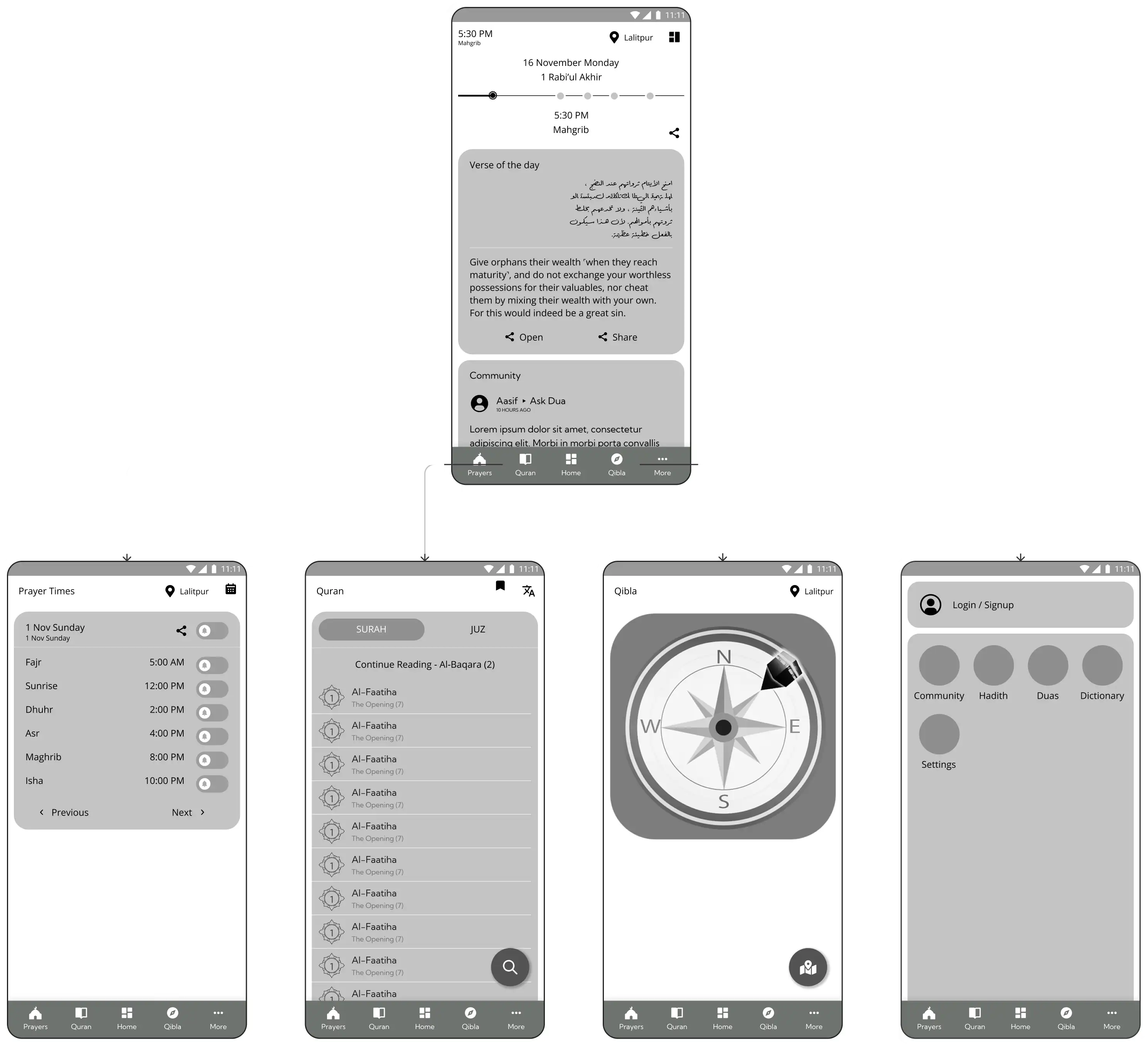
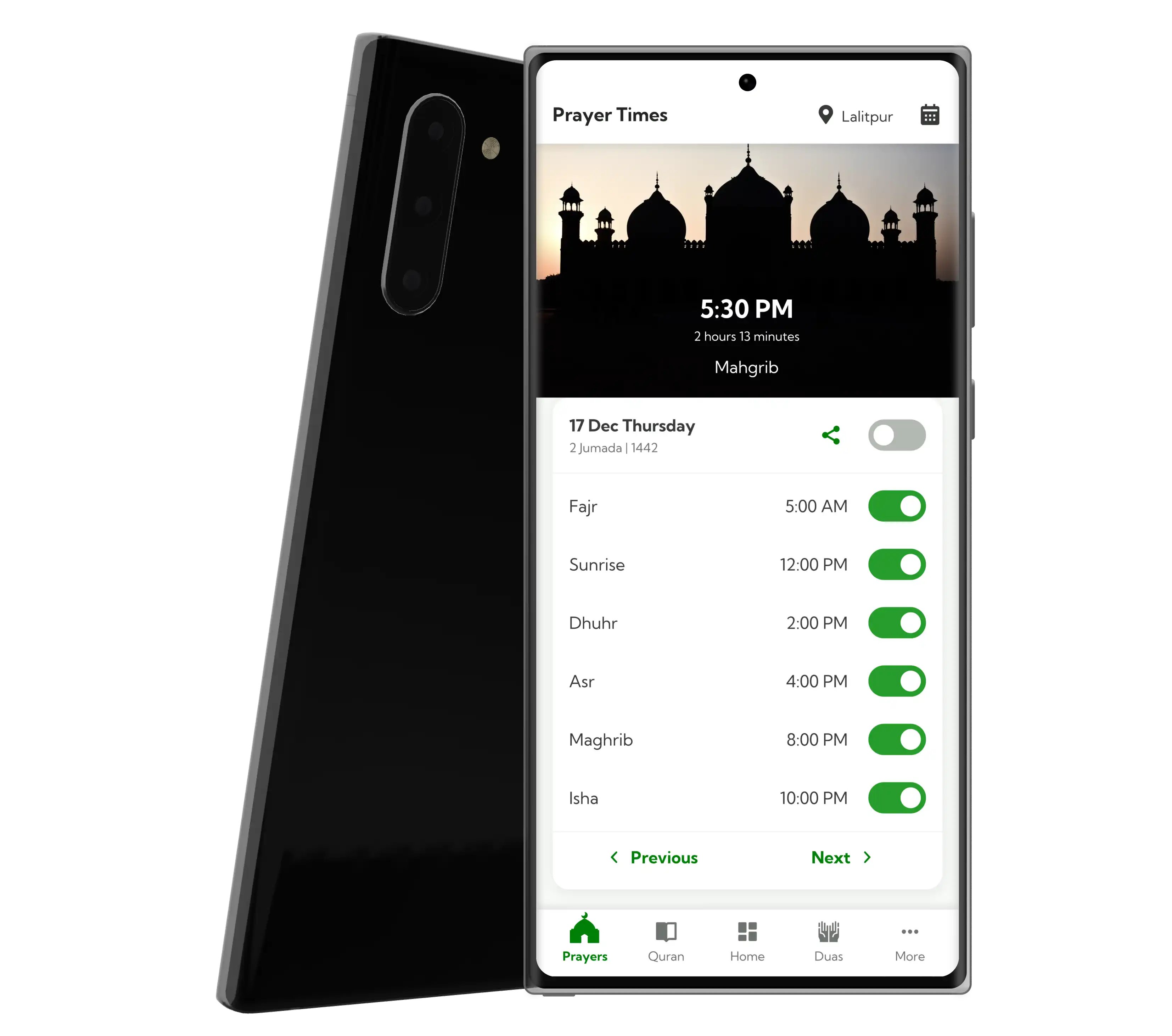
Tracking Prayer Times
Visual Designs
To make it easy to track prayer times, I've included
location selection
as well as
Hijri calendar
right inside prayer tab.
Also, I've placed prayer card at the bottom for easy reachability.
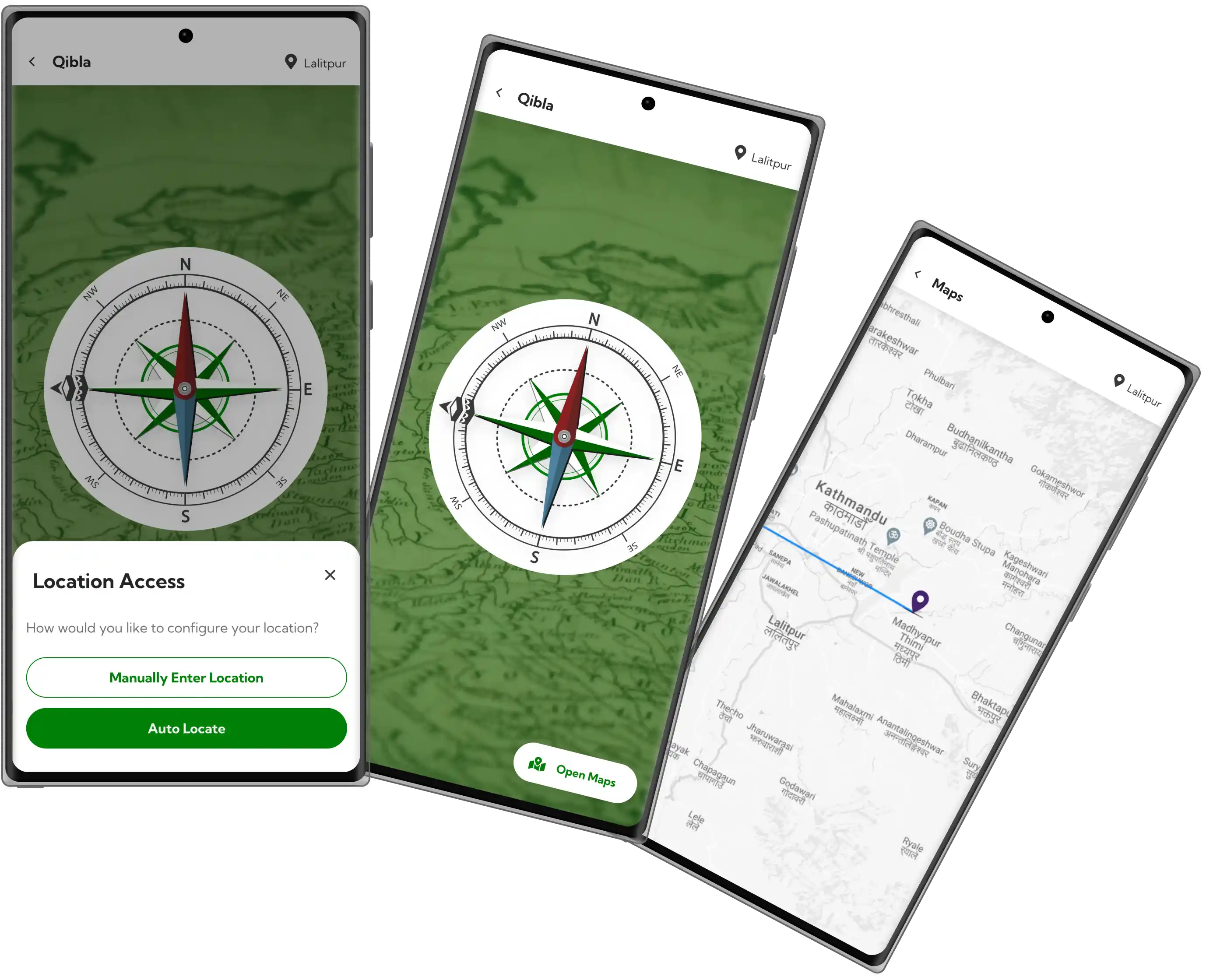
Showing Prayer Directions
Visual Designs
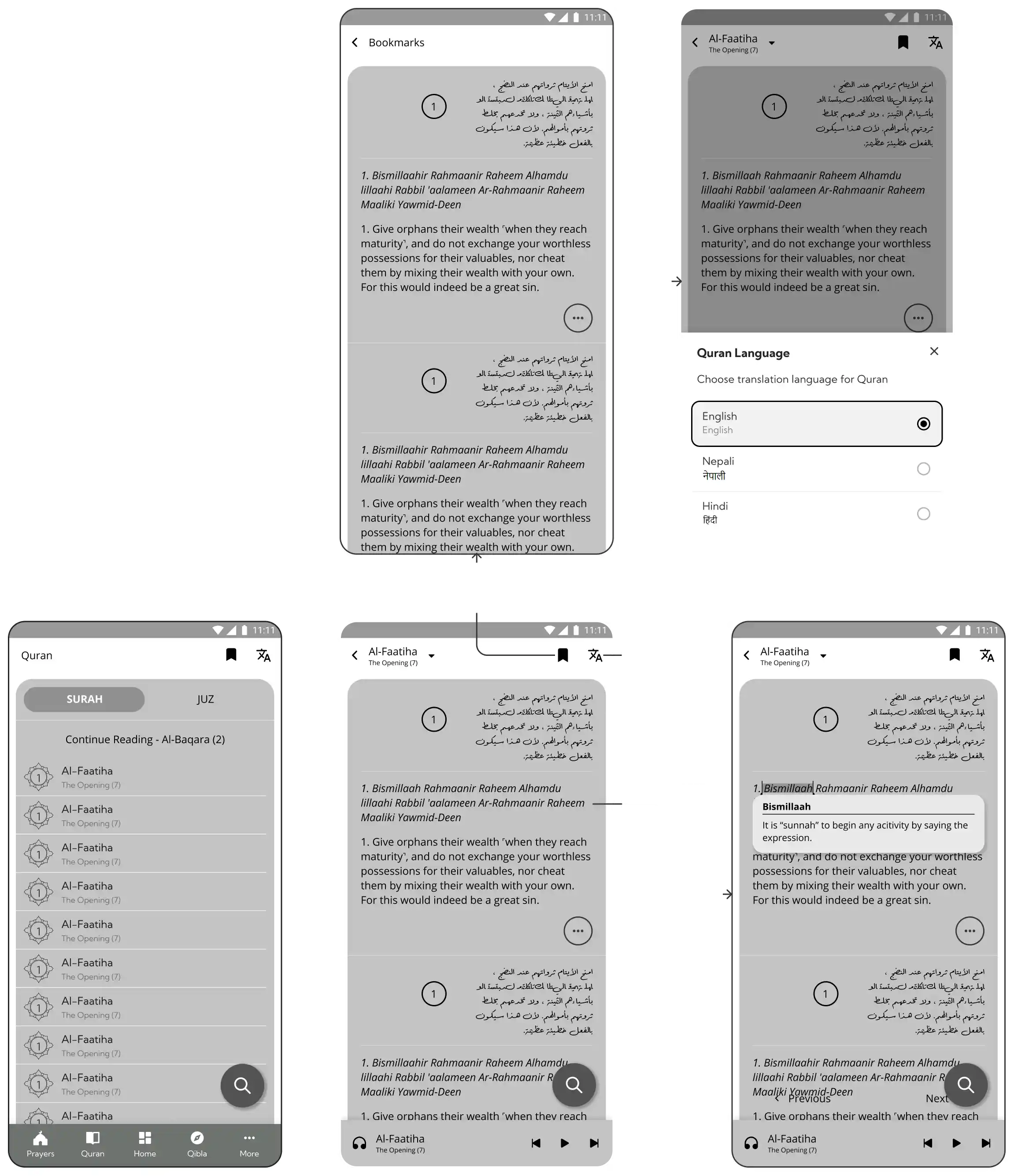
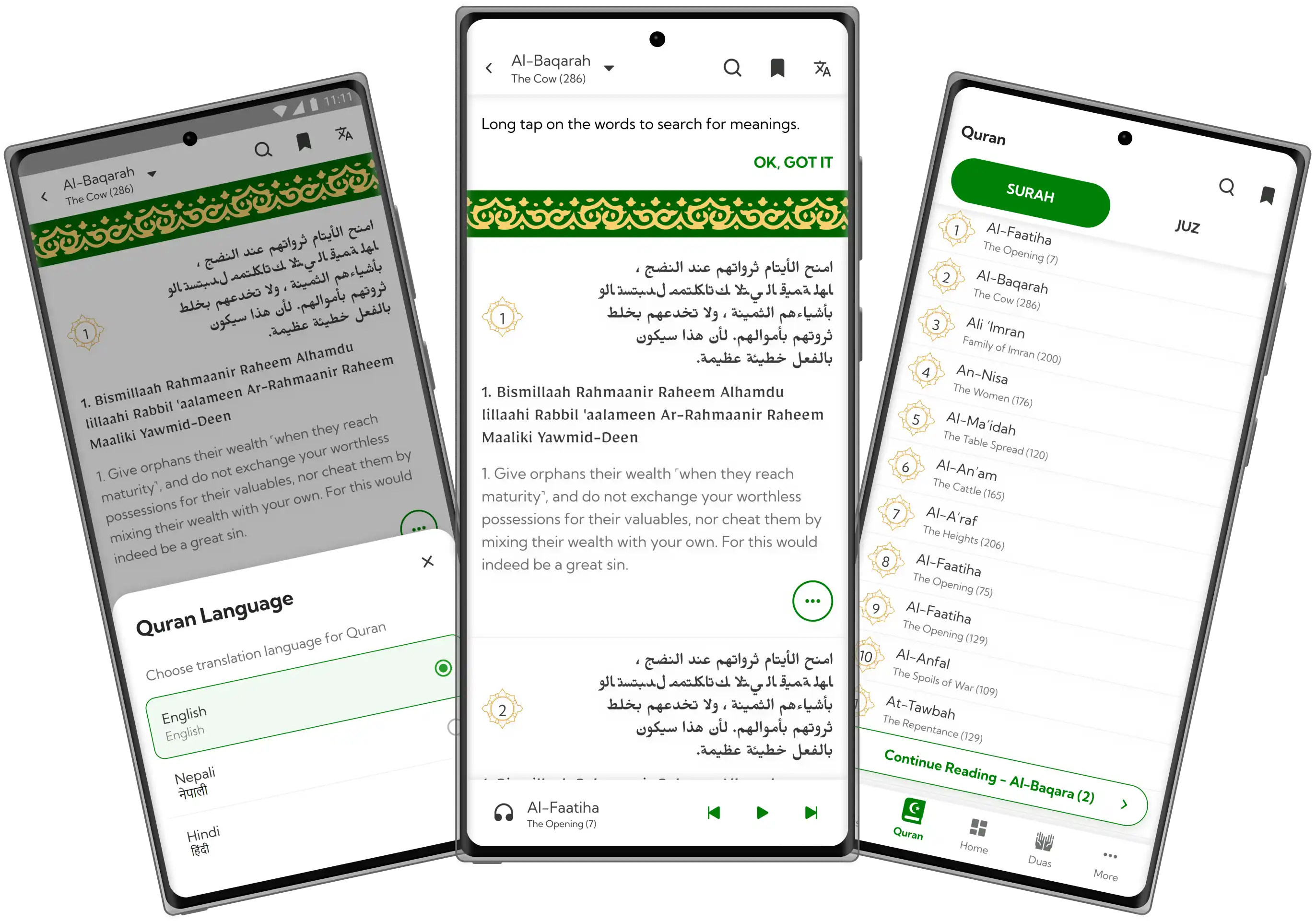
Adding Quran
Visual Designs
Since this app is targeted towards Nepali Muslims, I’ve added
Nepali language
option in Quran.
Also, I’ve given subtle visual touches to evoke cultural familiarity.
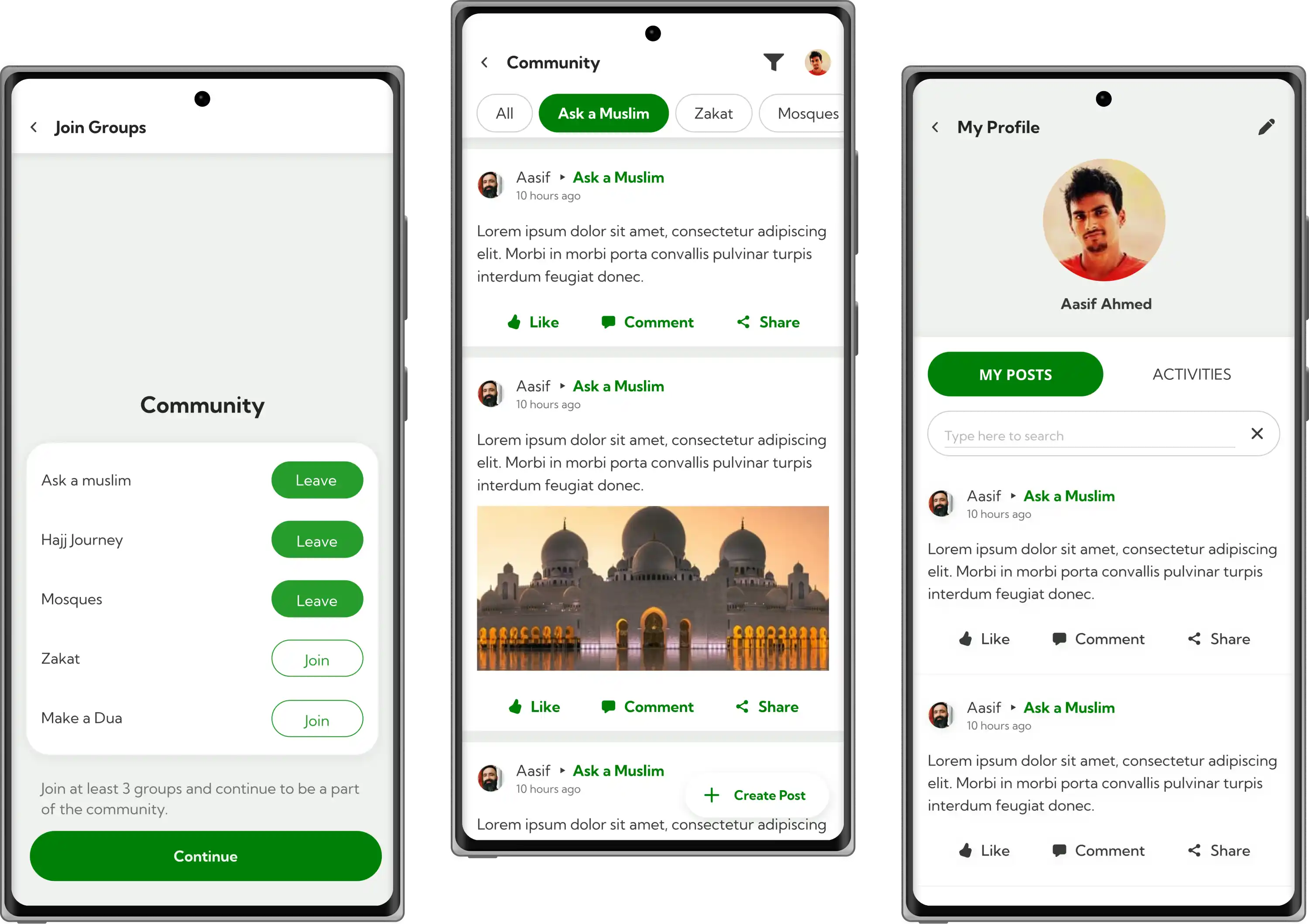
Creating a Community
Visual Designs
Validating Design Decisions
Usability Testing
To validate some of my visual design decisions, I created multiple variations of some screens and conducted remote moderated sessions with 5 participants.
I started asking
open ended questions
and asked them to explain their preference
Onboarding Design
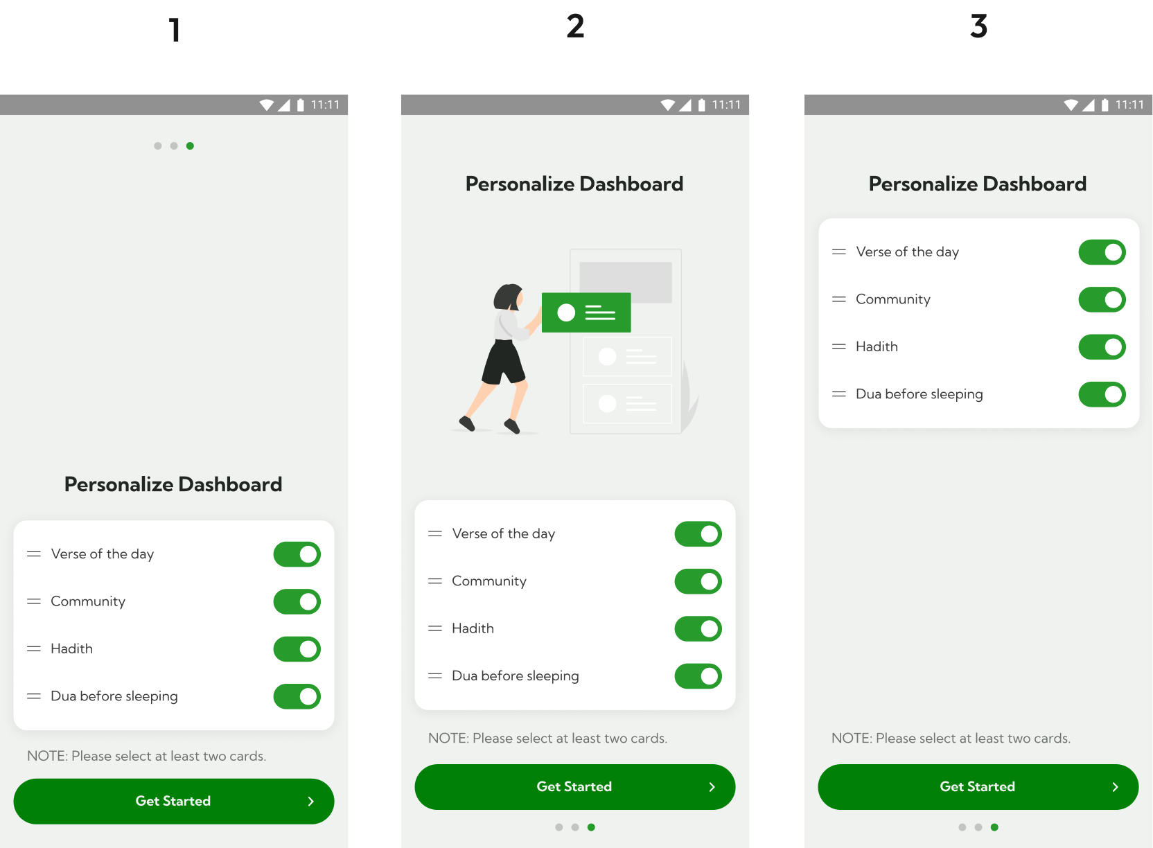
- 80% of users preferred screen 2 whereas 20% preferred screen 3.
Although 80% preferred screen 2, they didn’t like the
western style clothing
on illustration which was against their culture
Quran Screen
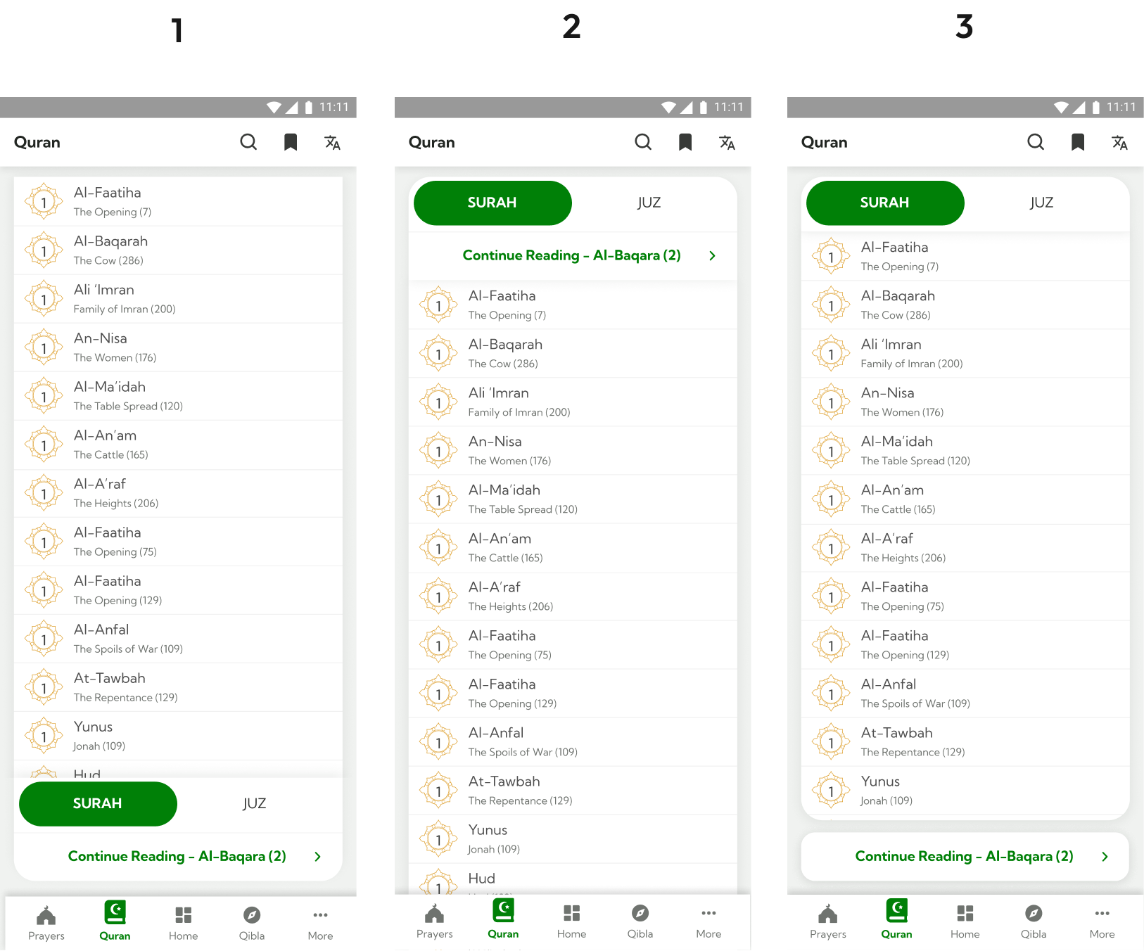
- 60% of users preferred screen 3 whereas 20% preferred screen 1 and 2 respectively.
They were
more likely to continue reading quran
than switching tabs for Surah and Juz.
Prayer Notification
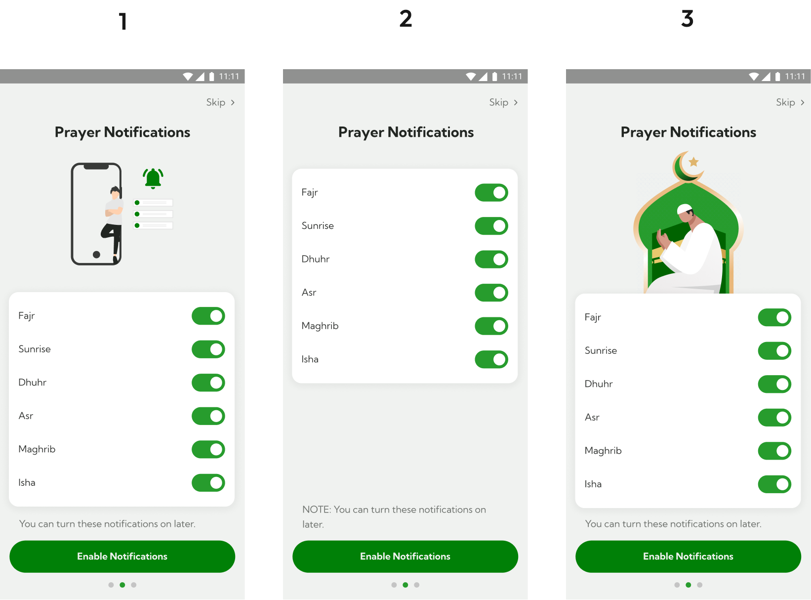
- 80% of users preferred screen 3 because of their familiarity with illustration whereas 20% preferred screen 1 and 2 respectively.
Polishing Visual Designs
Iterate
Based on usability testing, I revised existing screens and after 2 iterations, we were aligned with the product vision.
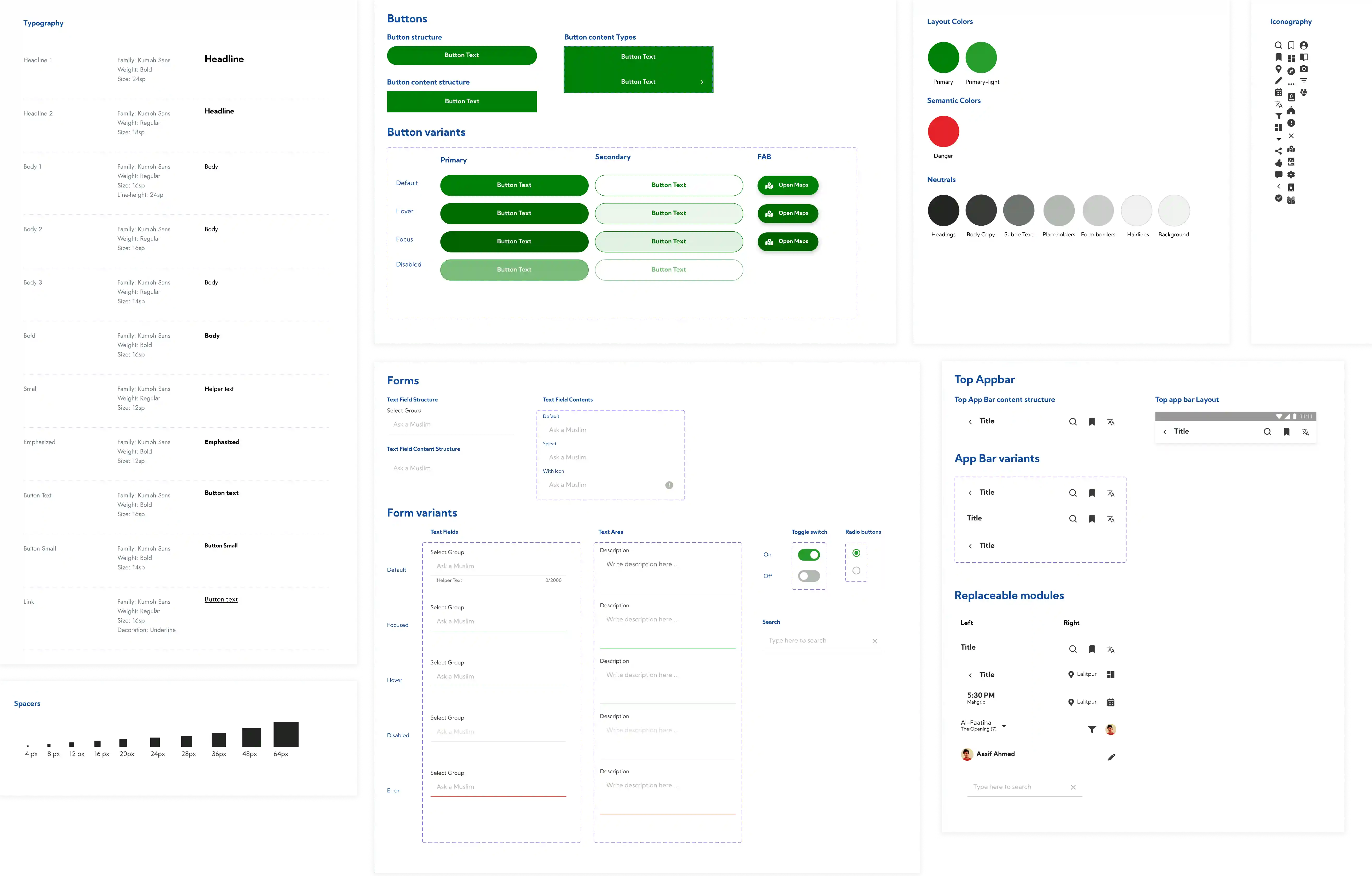
Creating Developer Handoffs
Design System
Once the designs were finalized, I put together all the component library, text, color styles and iconography to make it easy for the developers.
Also, while working on visual designs I made sure that the colors were
ADA complaint
to cater wide range of users.
Key Takeaways
Learnings
It was quite challenging for me to design app for different culture. With frequent communication with client and one of my muslim friend, I successfully pulled of this project.
Here are some of the key things I learned from this project:
- Some knowledge of RTL Language
- Communication is the key
- Cultural aspects influence design decisions
- Testing must be carried out as soon as wireframes are ready to get initial user insights